The 'Pantone' Pitfall: Why Digital Proofs Lie on Natural Materials
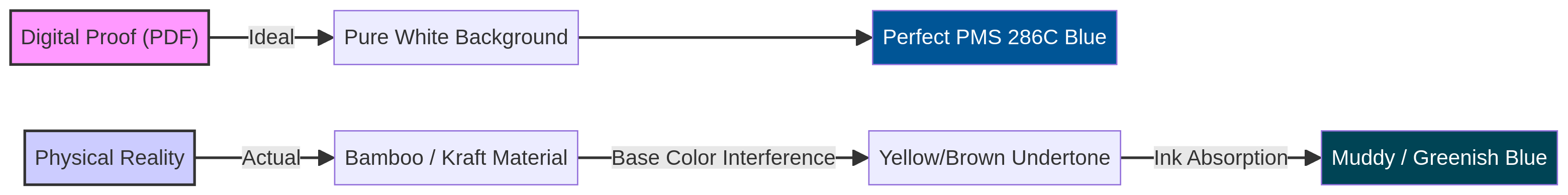
You send your brand guidelines to the factory. "Our logo is PMS 286C Blue." The factory sends back a PDF proof. It looks perfect. Crisp, vibrant blue on a beige background. You approve it.
The shipment arrives. The logo is green. Or muddy brown.
You call the factory. "You used the wrong ink!" They reply: "No, we used PMS 286C ink."
They are both right. And you are both wrong.
In digital printing (CMYK) or screen printing, ink is semi-transparent. When you print on white paper, the white reflects light through the ink, making the color pop. When you print on Bamboo, Kraft Paper, Cork, or Wheat Straw, the substrate is yellow or brown.
Blue ink + Yellow Bamboo = Green Logo. Blue ink + Brown Kraft = Muddy Dark Blue.
In practice, this is often where Custom Branding decisions start to be misjudged. You trusted the PDF (which assumes a white base) instead of the physics of light.
The Fix:
- White Underbase: Ask the factory to print a layer of white ink under your logo first. This creates a neutral canvas. It costs more (one extra screen/color), but it saves your brand.
- Physical Pre-Production Sample (PPS): Never approve a natural material order based on a PDF. Demand a photo of a real printed sample, or better yet, the physical sample itself.
- Adjust the PMS: Sometimes, you need to pick a lighter or different Pantone shade to compensate for the substrate darkening it.